
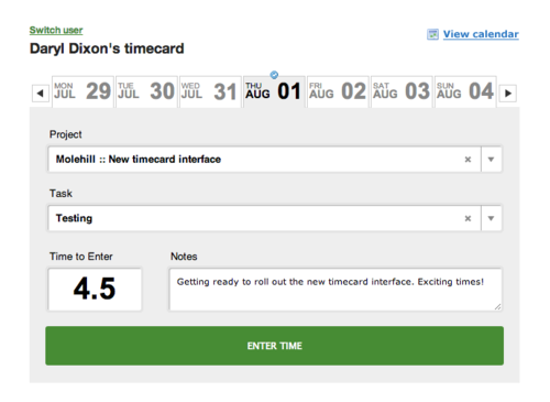
A New Timecard Experience
We’re getting ready to roll out an update to Tick’s timecard in the next week! The update streamlines the way you select your client, project and task.
Here are the details.
-
Combined client and project selection
The new timecard reflects our philosophy that a workflow is most efficient when it’s boiled down to necessities. Applying this to the timecard update, we eliminated the client select menu by organizing the projects by client and adding a search field.
-
Search to select a project
To select a project, you can start typing your project or client name rather than scrolling and the list will shrink as you type. The same is true for selecting a task; enter the first few letters and select a task from the smaller list.
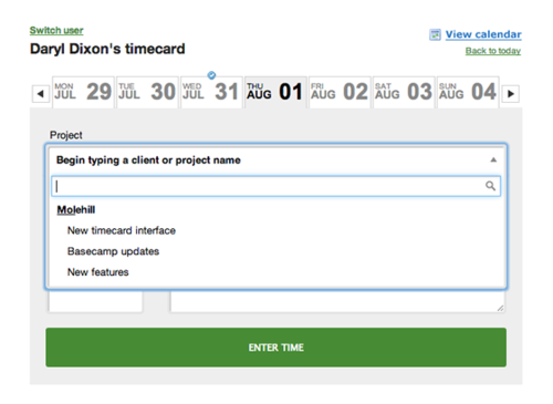
Now, your fingers can stay on the keyboard
It’s the small details that make a difference in the workflow. With search fields added to the select menus, you can now quickly create time entries without taking your fingers off the keyboard. It may take you a day or so to get used to using this, but once you do, you’ll never go back.
-
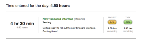
A new look for your completed time entries
Also in this update, you’ll notice a difference in how your completed time entries look below the timecard. The design is much cleaner and they provide better information. Now you can see the project budget and task budget side-by-side with your notes showing by default.
We look forward to hearing how it works for you!